BN9
- Visual Identity +
- Print Design +
- Signage +
- Digital Campaign +
- Social Media Assets +
- Branding +
- Document Templates +
- Merchandise Design +
- Wayfinding +
- Brand Guidelines
BN9 is a series of arts projects designed to improve the creative offering and reach new audiences in Newhaven. It is a five-strand series that aims to animate spaces, instil pride and involve the community.
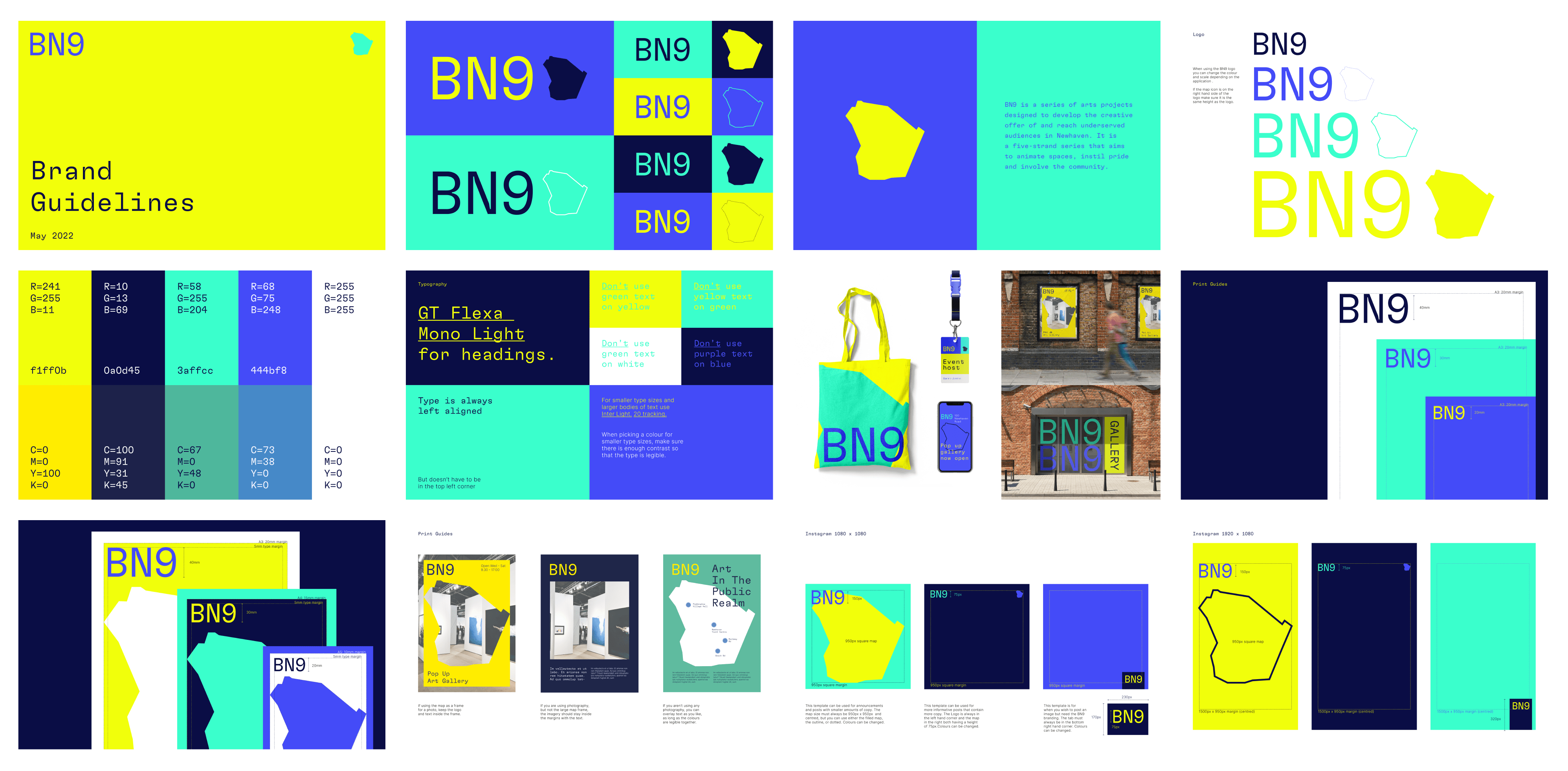
Two Pens were tasked by Towner Eastbourne and Creative Newhaven to create a brand for Newhaven's new BN9 programme. The visual identity needed to be flexible to stretch across printed and digital media, as well as a number of other applications. It needed to be eye-catching and engaging, while also being accessible and not feel exclusive.

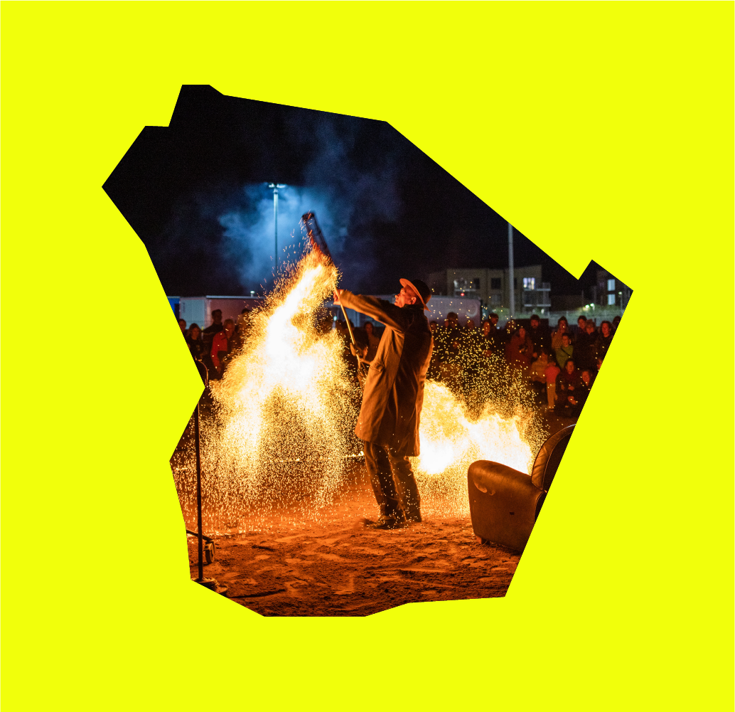
The concept focuses on the area of BN9, using it's shape as the core visual identity; whether as a map to guide and inform or a frame for imagery. The shape is used as an outline, block colour stamp or a cut out image frame giving the brand flexibility and fluidity.
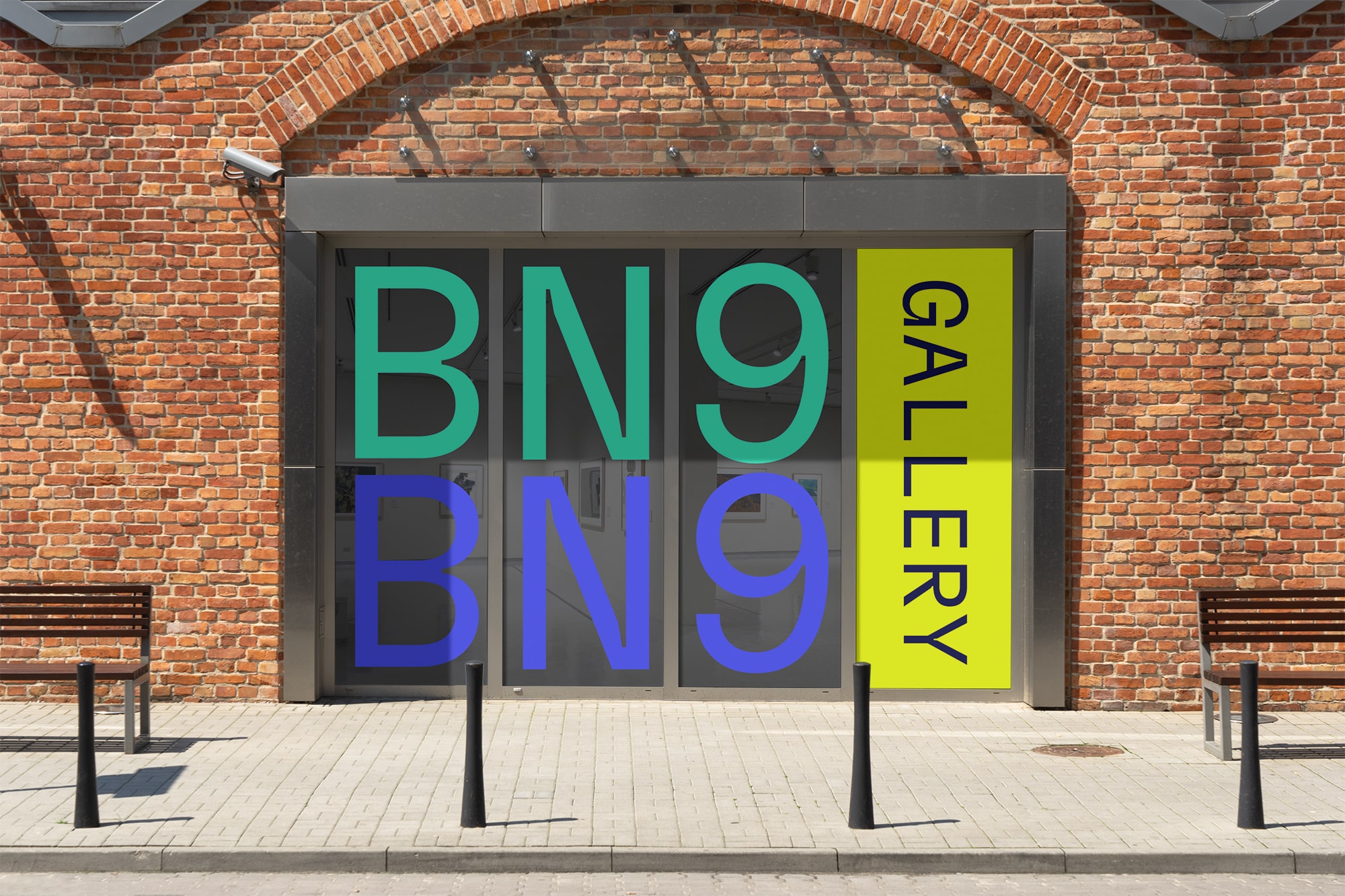
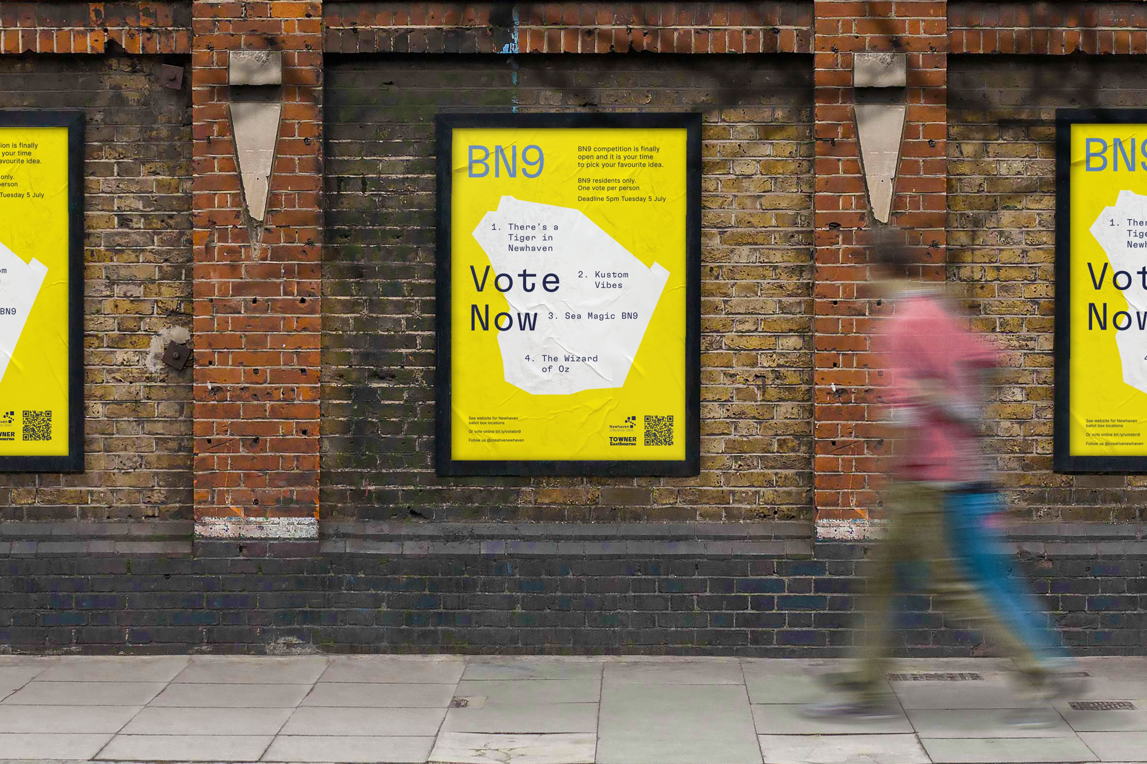
The brand needed to be versatile so it could be applied to a number of items, including digital documents, social media templates, window stickers and merchandise. Some of these are shown below.
We created social templates for the launch and to help the team continue creating branded posts in future.
The bold collage appearance shows creativity and craft and the colours are a overtly positive representation of the countryside, coastline and industry that make BN9.
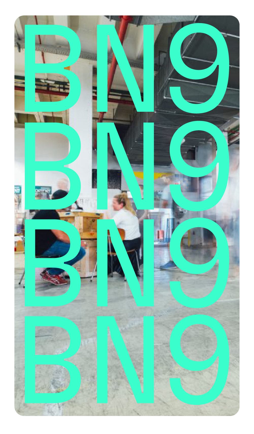
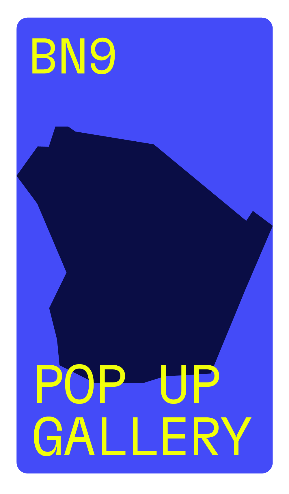

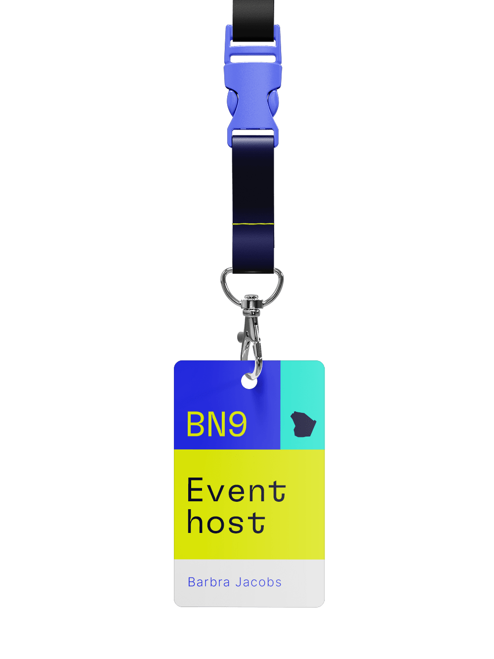
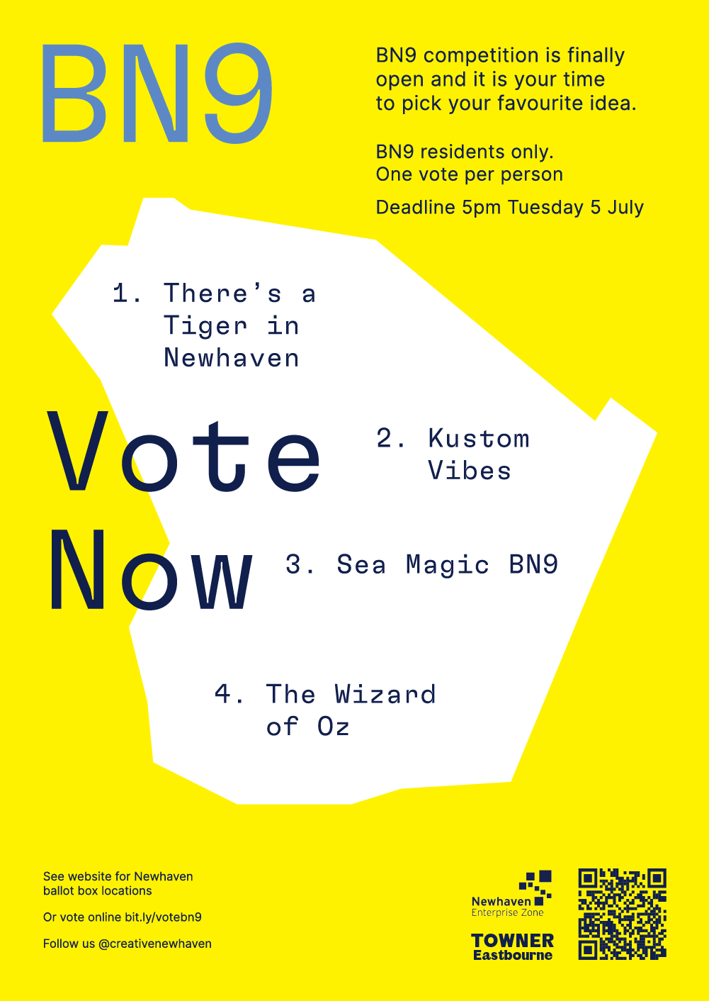
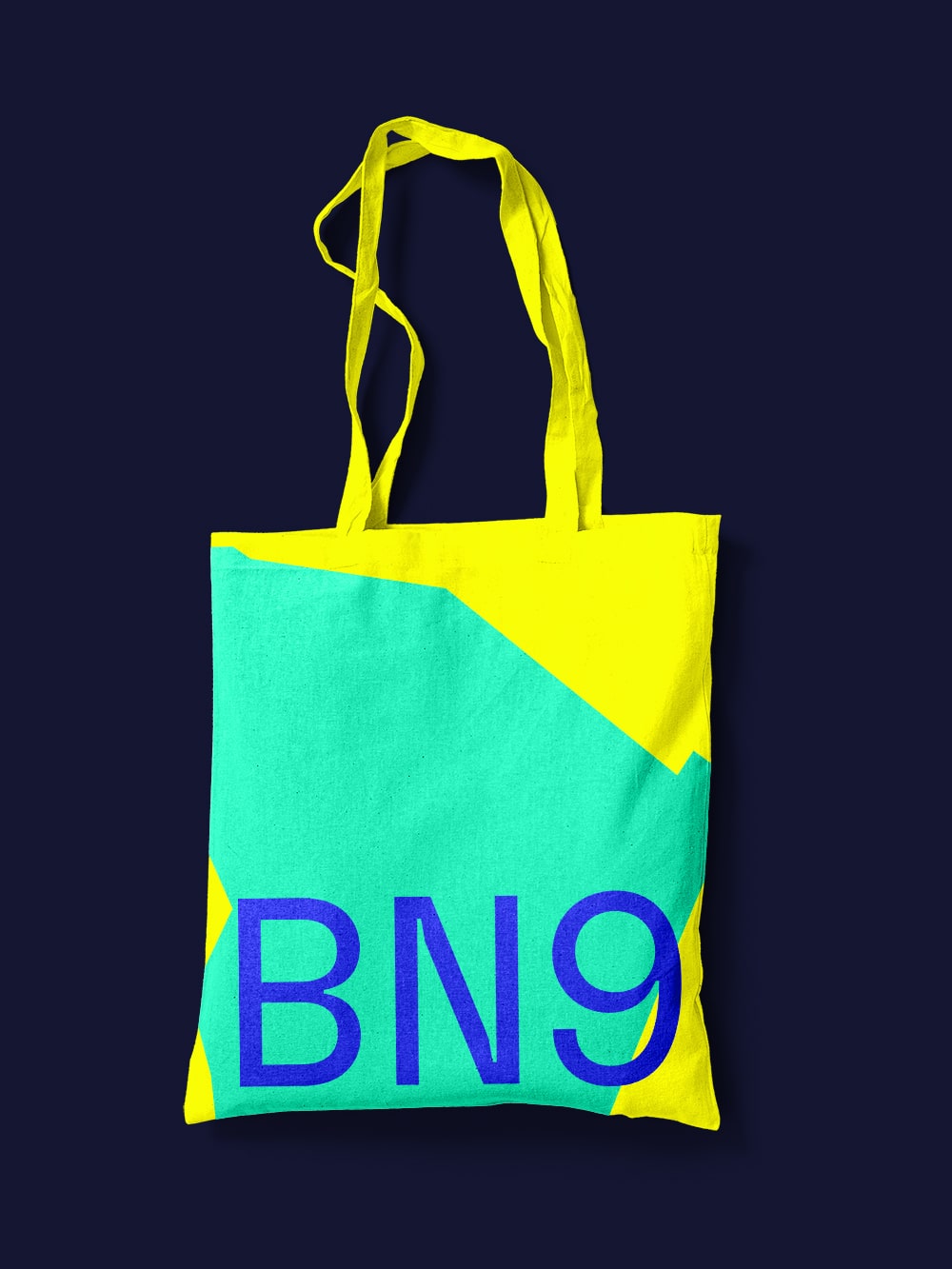
The brand successfully translates across a variety of different uses for merchandise, posters and window vinyls, shown in the surrounding images.
This demonstrates how important it is to create a strong visual system making it easy to apply it to different items and present a clear and confident brand.
