Eastbourne Alive
- Visual Identity +
- Print Design +
- Social Media Assets +
- Website Design +
- Document Templates +
- Merchandise Design +
- Wayfinding +
- Signage
Eastbourne ALIVE is an ambitious community programme for East Sussex to coincide with Turner Prize 2023. It seeks to empower young people to create a new legacy for Eastbourne through a wide range of projects and creative activities, and development of artistic practice and creative skills. It aims to broaden access to art and culture through inclusive participation in high quality cultural experiences and creative activities in and around Eastbourne.
We were commissioned by Towner Eastbourne with creating a brand that celebrates our town and appeals to its residents, particularly young people, whilst making art and culture open to all. The identity needed to be exciting and energetic, whilst being accessible to those who interact with it. Flexibility was also key as the Eastbourne ALIVE programme scopes art, workshops, events and education, the brand had to seamlessly transition from print applications to digital platforms.
With a target of becoming an annual ‘festival’ for the town that would create a legacy for the Turner Prize and the wraparound project, the brand should be able to stand alone with its own individual identity and be a catalyst for enduring change.

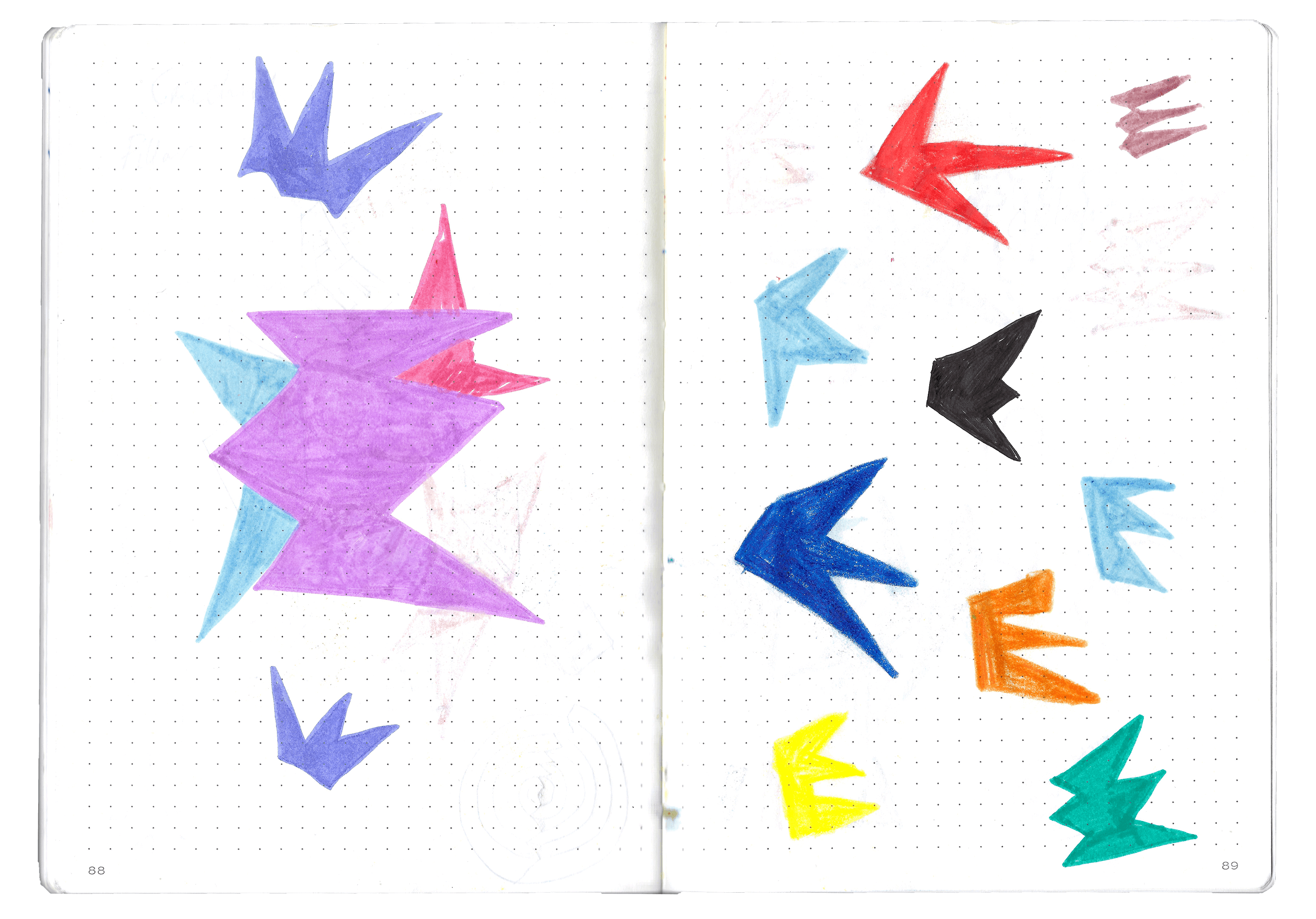
Our approach
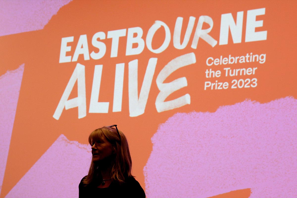
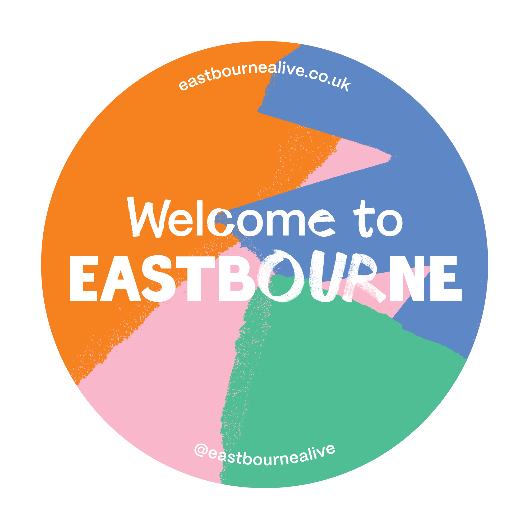
A bold yet approachable visual identity featuring a hand-rendered logo, simple textures, and playful shapes. Focused on challenging the stereotypes about Eastbourne and making modern art more relatable. The Eastbourne ALIVE brand celebrates the town’s arts, culture, and, most importantly, its people. We chose a colour palette to reflect this and stand out from the town’s existing visuals.
The brand is applied with confidence, going big with shapes and application, developing the identity into a flexible visual system that allows for seamless adaptation across various formats and mediums. From towering wraps to small window vinyls, our designs maintained consistency while adapting to different contexts.
"Two Pens delivered exceptional branding, website design, and other marketing materials for Eastbourne ALIVE. Despite incredibly tight deadlines, they maintained an impressive pace without compromising creativity or attention to detail. It has been a real pleasure to work with them. I wouldn't hesitate to recommend them."
Sarah Dance
Eastbourne Alive Project Director


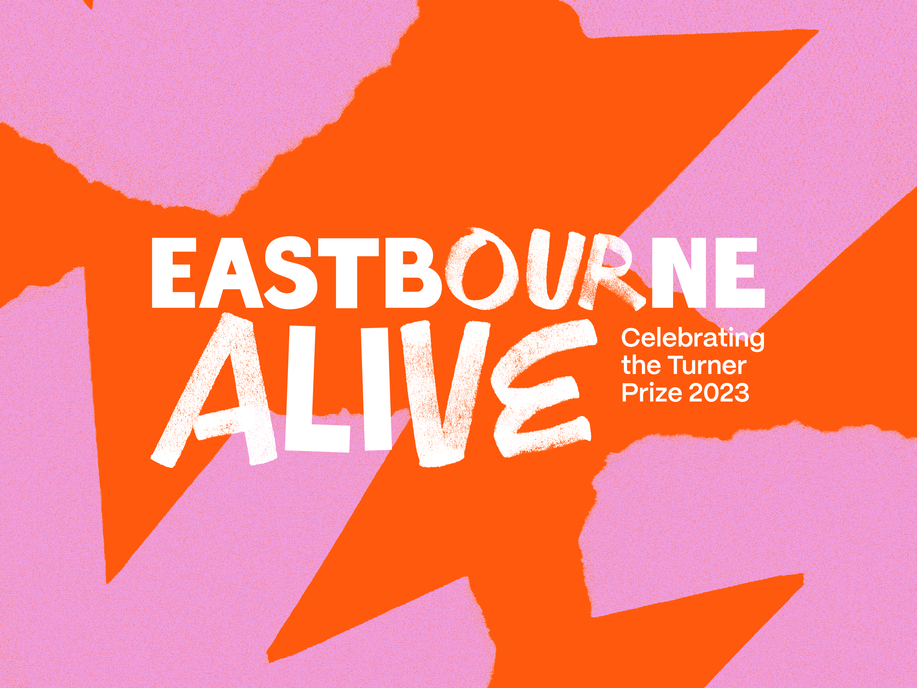

Eastbourne coming ALIVE
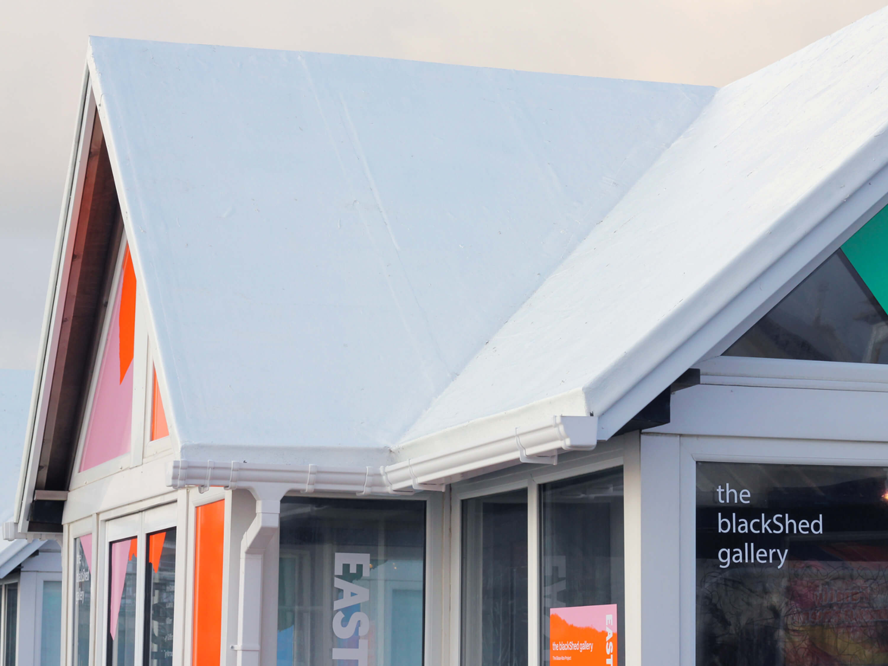
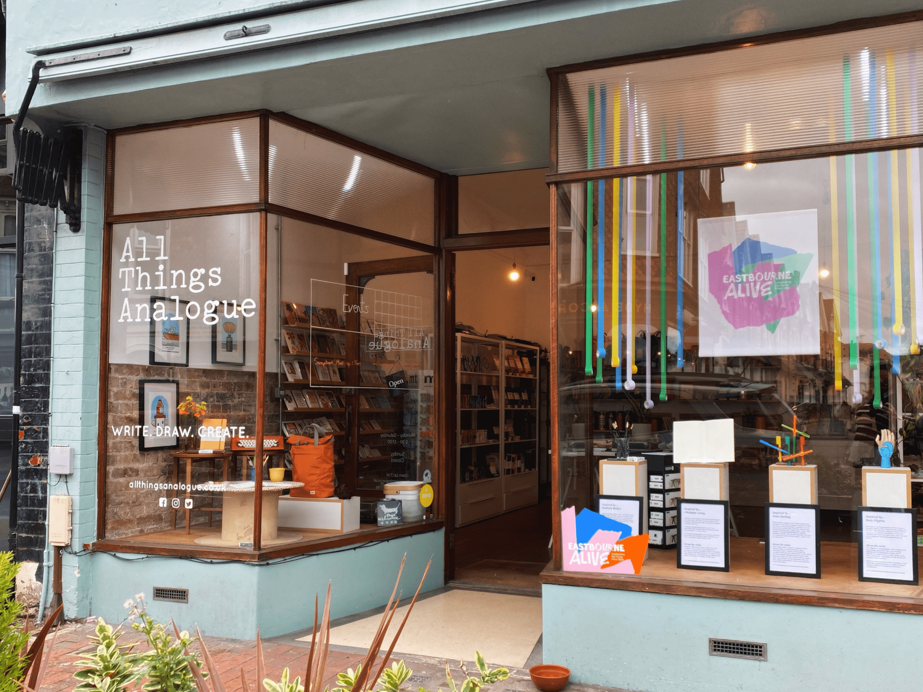
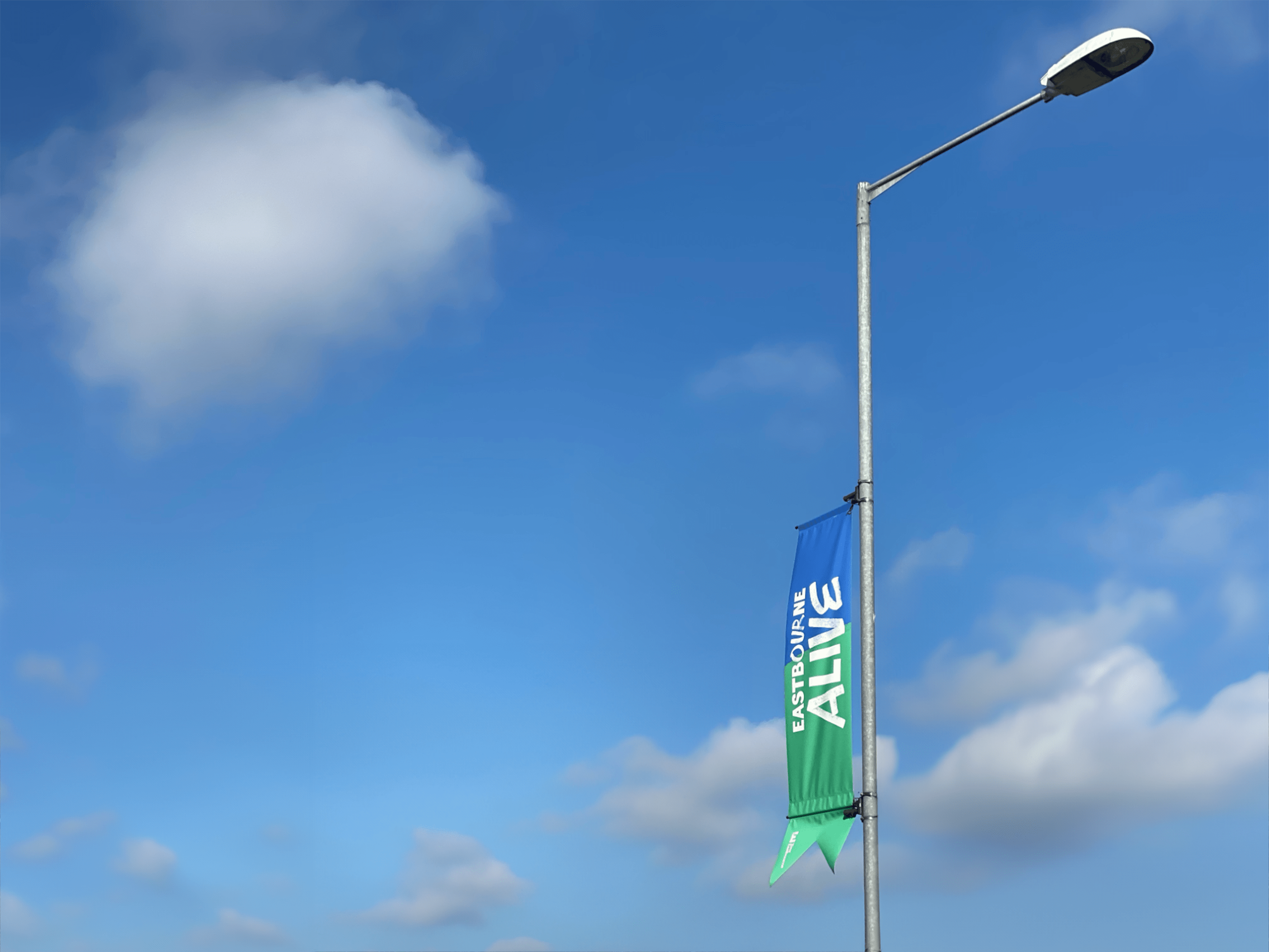
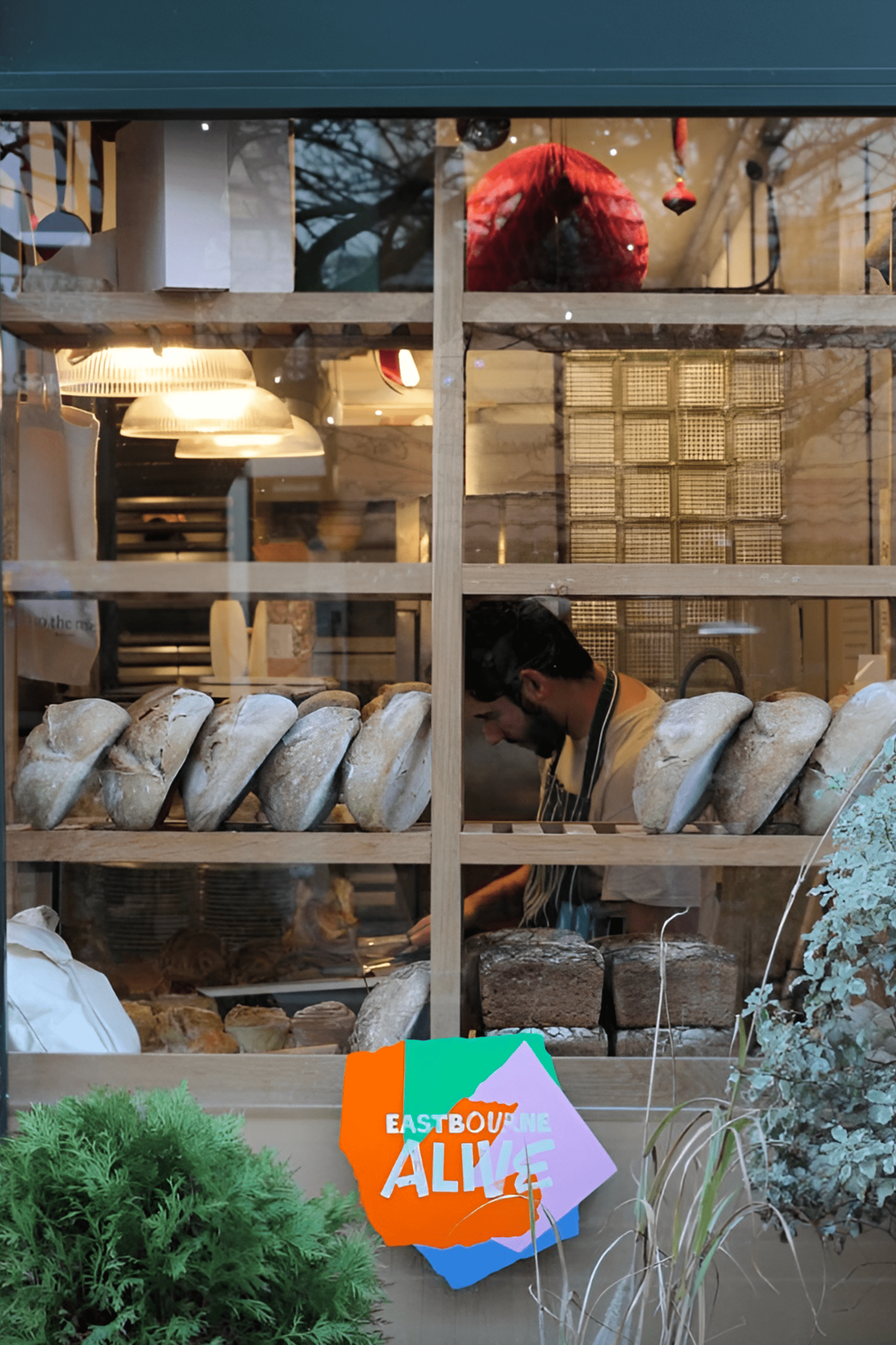
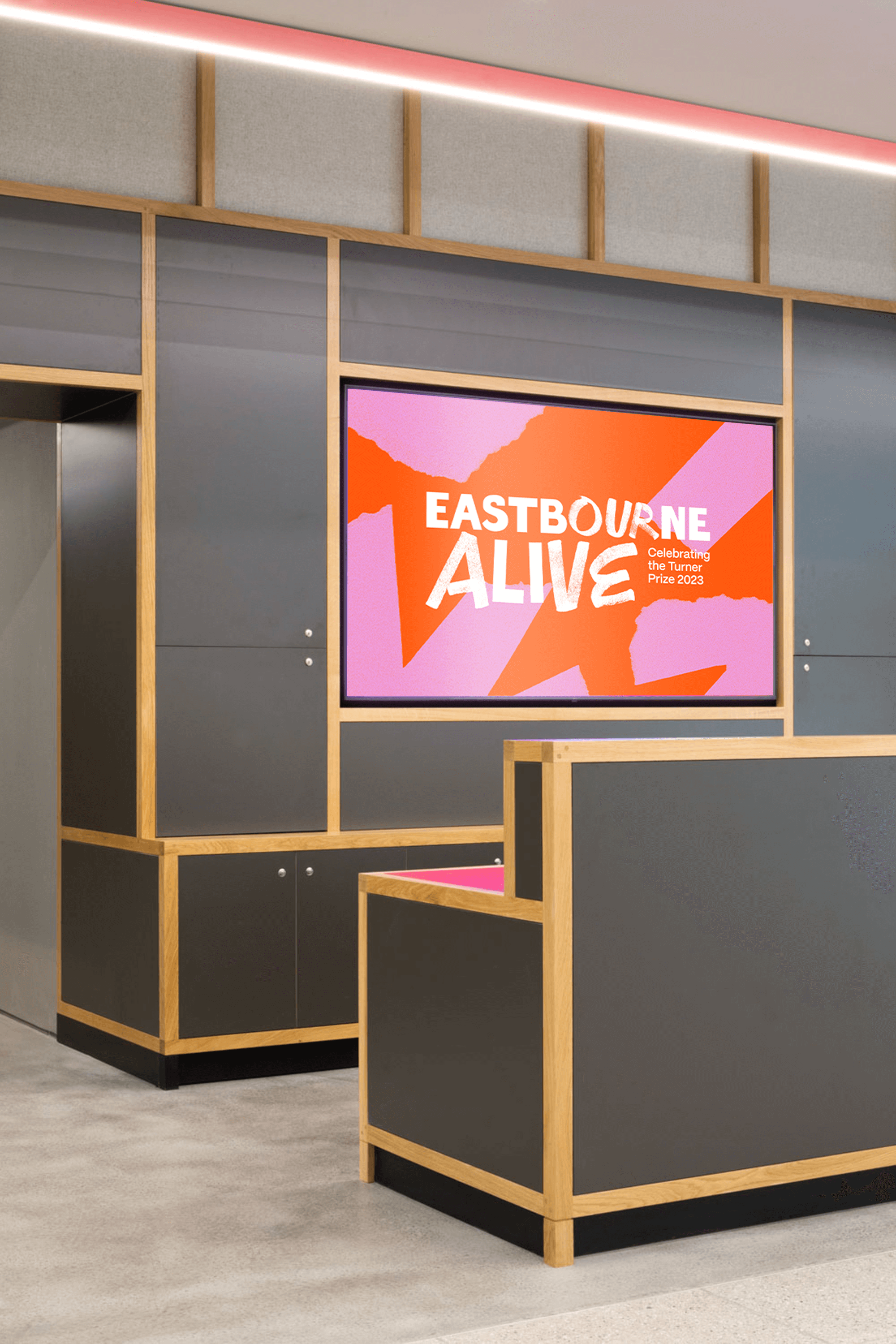
The first application of the brand was dressing the town; igniting excitement and engaging the public. We designed lamp post banners and floor vinyls for the train station to welcome visitors, and window vinyls for local businesses to display in their shop fronts. These were so in demand that we had a waiting list!
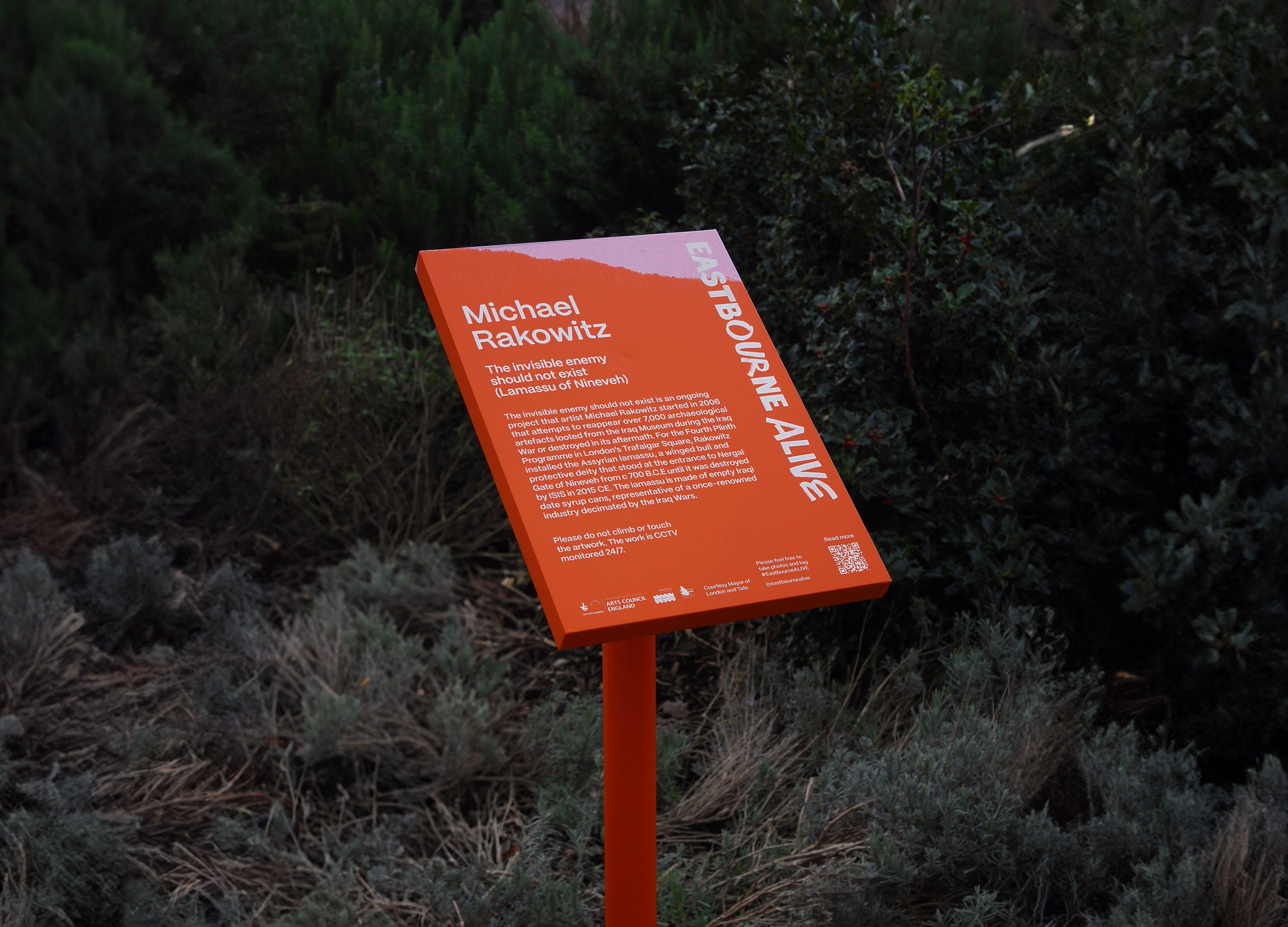
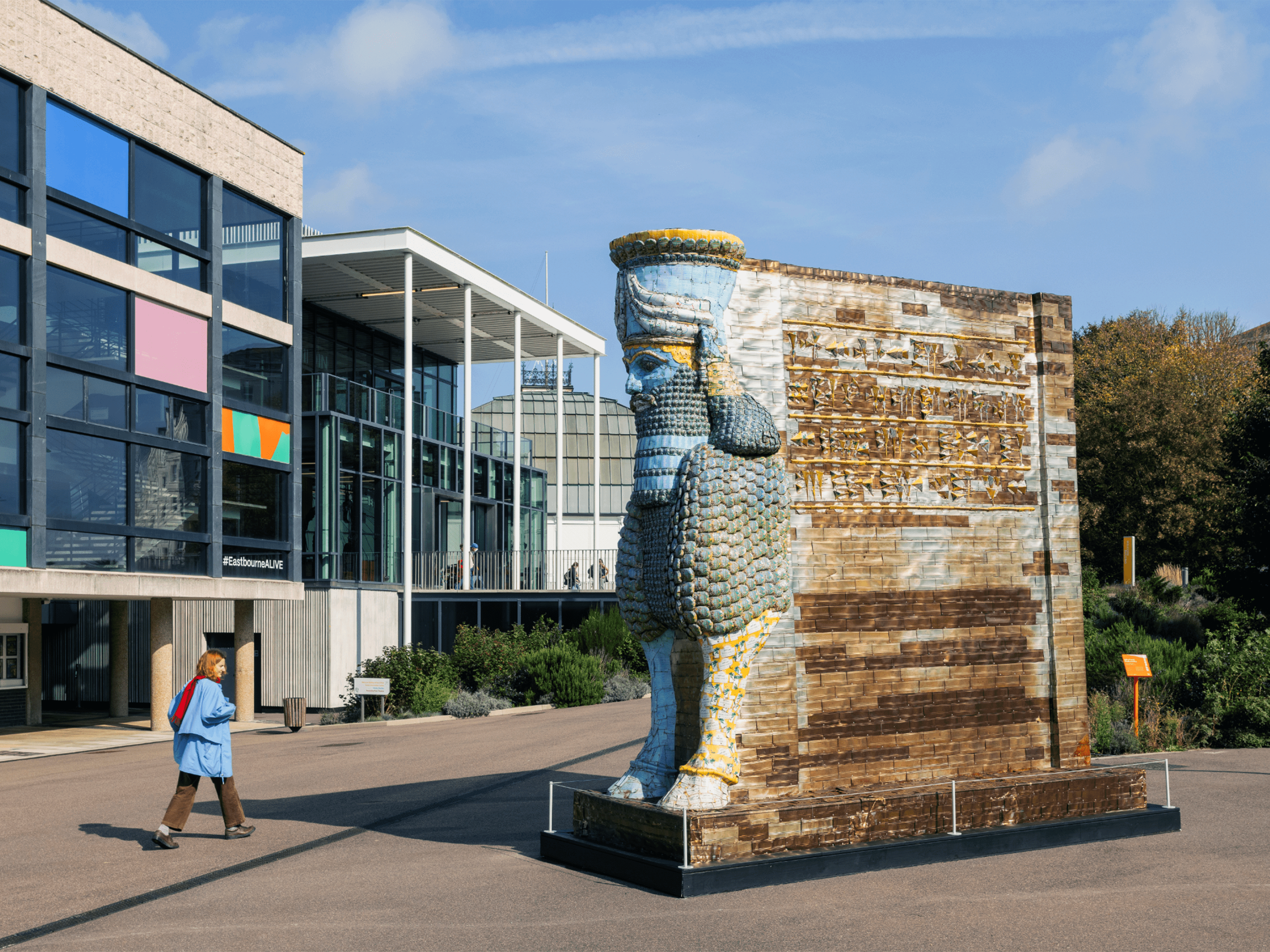
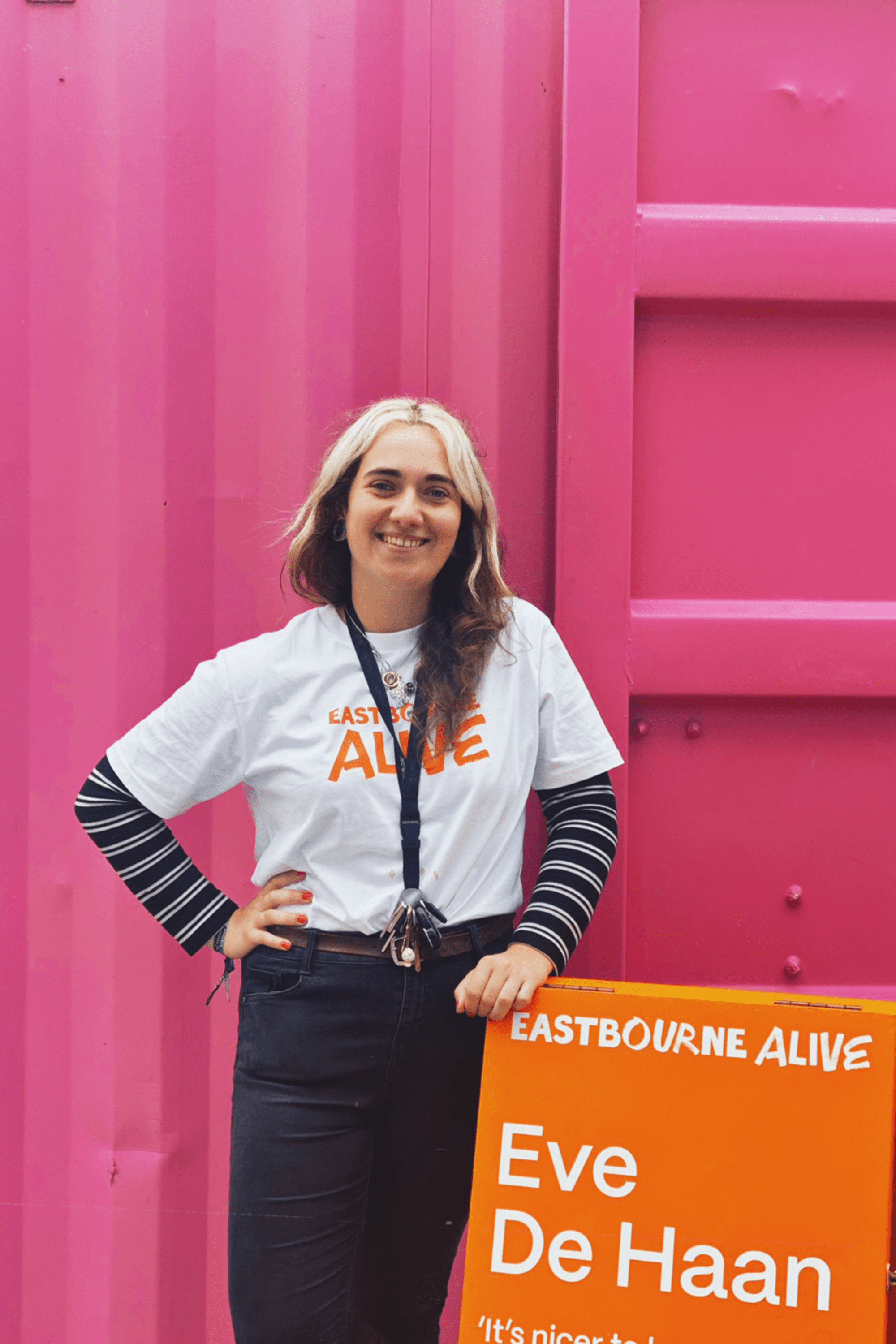
As part of the programme four major artists were commissioned to display their artwork throughout the town; Michael Rakowitz, Helen Cammock, Eve De Haan and Nathan Coley. To mark these artworks as part of Eastbourne ALIVE, we worked with a local signage company to produce custom interpretation boards. Each of the four locations had a consistent look even though they were different formats; 1 x A-board, 1 x wall plaque and 2 x free-standing. We the adapted the formatting further for The Devonshire Collective and their own Eastbourne ALIVE art trail, producing interpretation boards for all their artworks.
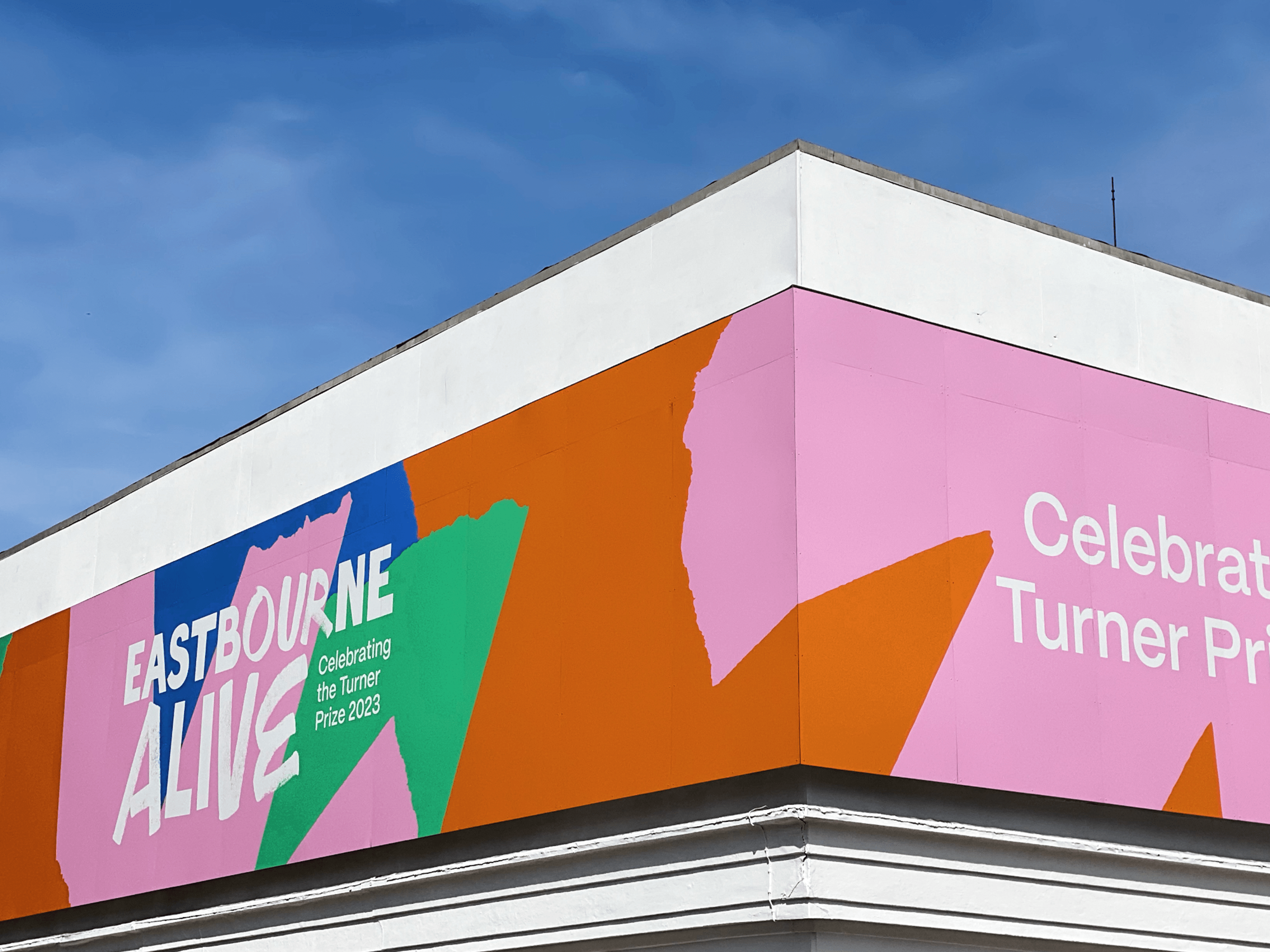
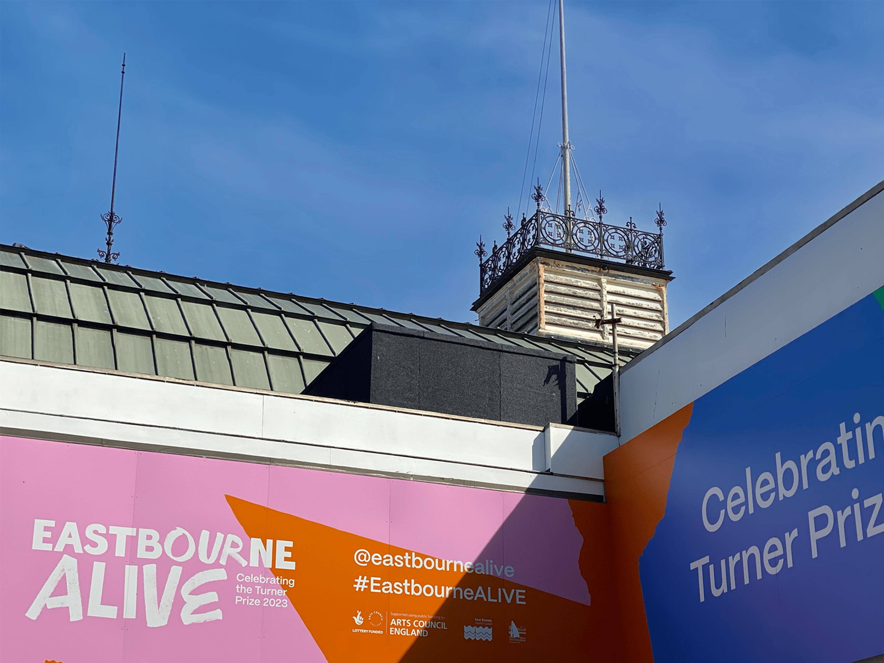
Among the larger applications was a 44 metre wrap for The Eastbourne Winter Garden. This was the town’s first taste of the Eastbourne Alive branding so needed to make an impact. It’s bold, colourful aesthetic attracted a lot of attention.
Once the panels were taken down they have been reused on the Redoubt Fortress, as with all our projects, we try to minimise waste and consider the environmental impact.
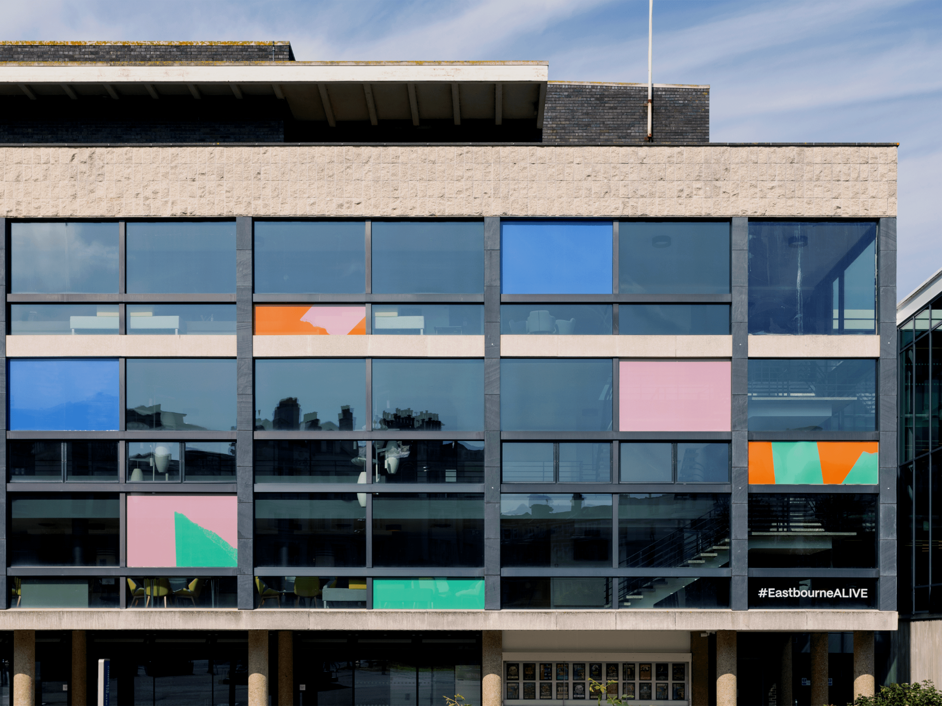
By far the biggest application covered the front of the Grade II listed Congress theare which sits next to Towner, the large scale window vinyls had to be bold but also sympathetic to the building’s architecture. For this project we used a perforated vinyl that is only printed on one side making the design visible from the outside, but from the inside looking out it is almost invisible as we did not want to affect the light within the theatre.
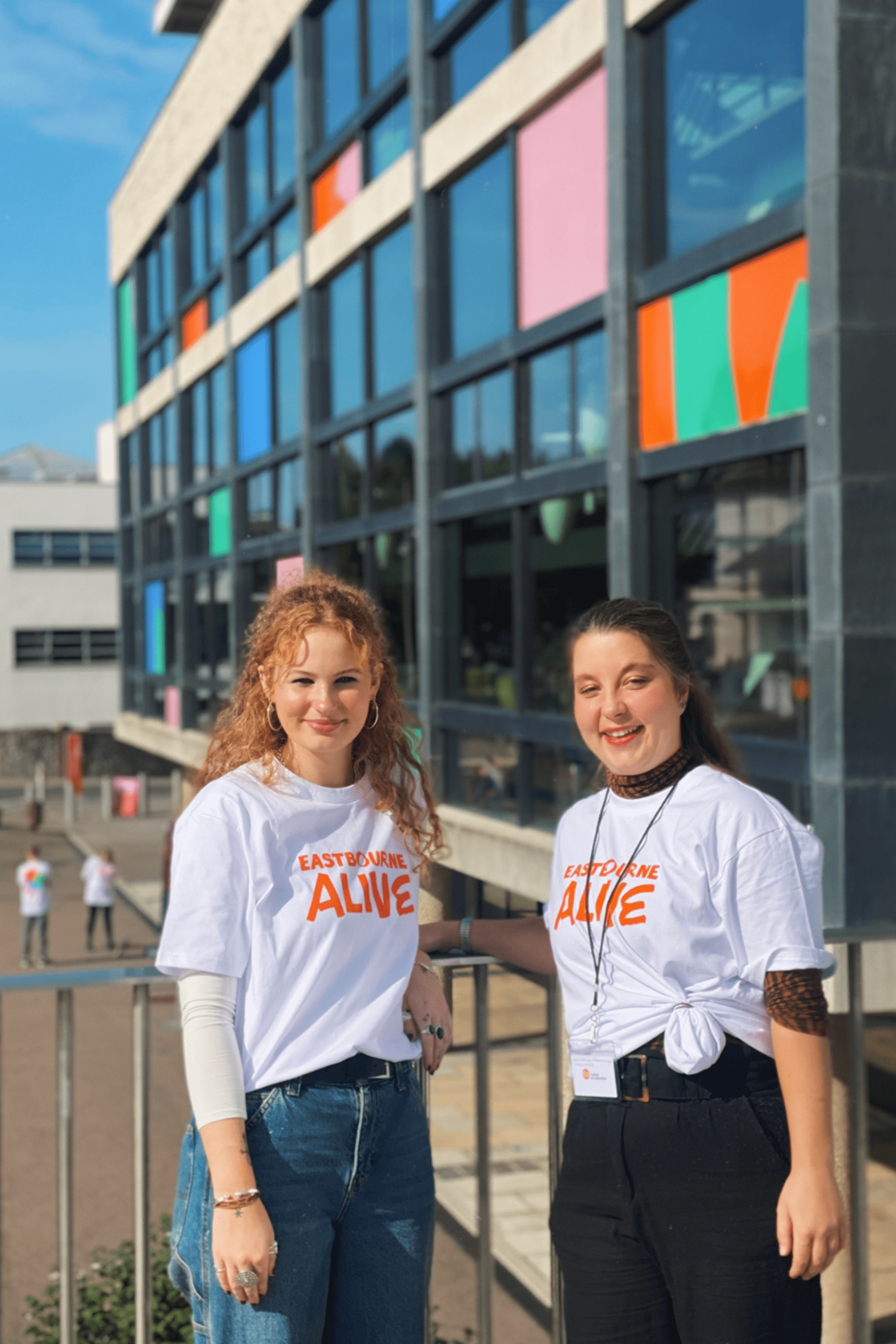
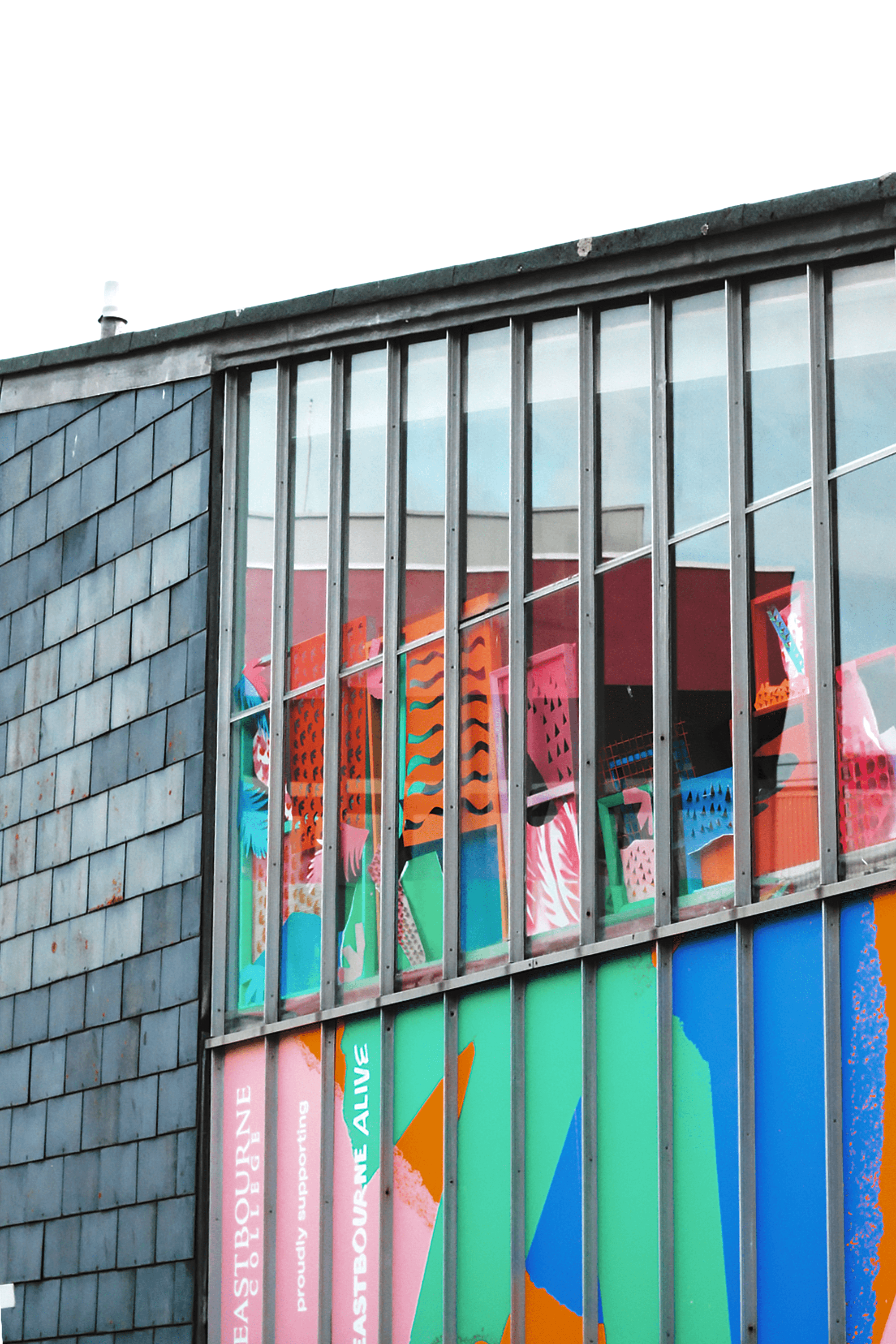
Our designs on Eastbourne College’s Art block followed the stronger style of the Winter Garden wrap and was presented next to the College’s art student’s own responses to the Eastbourne ALIVE project.
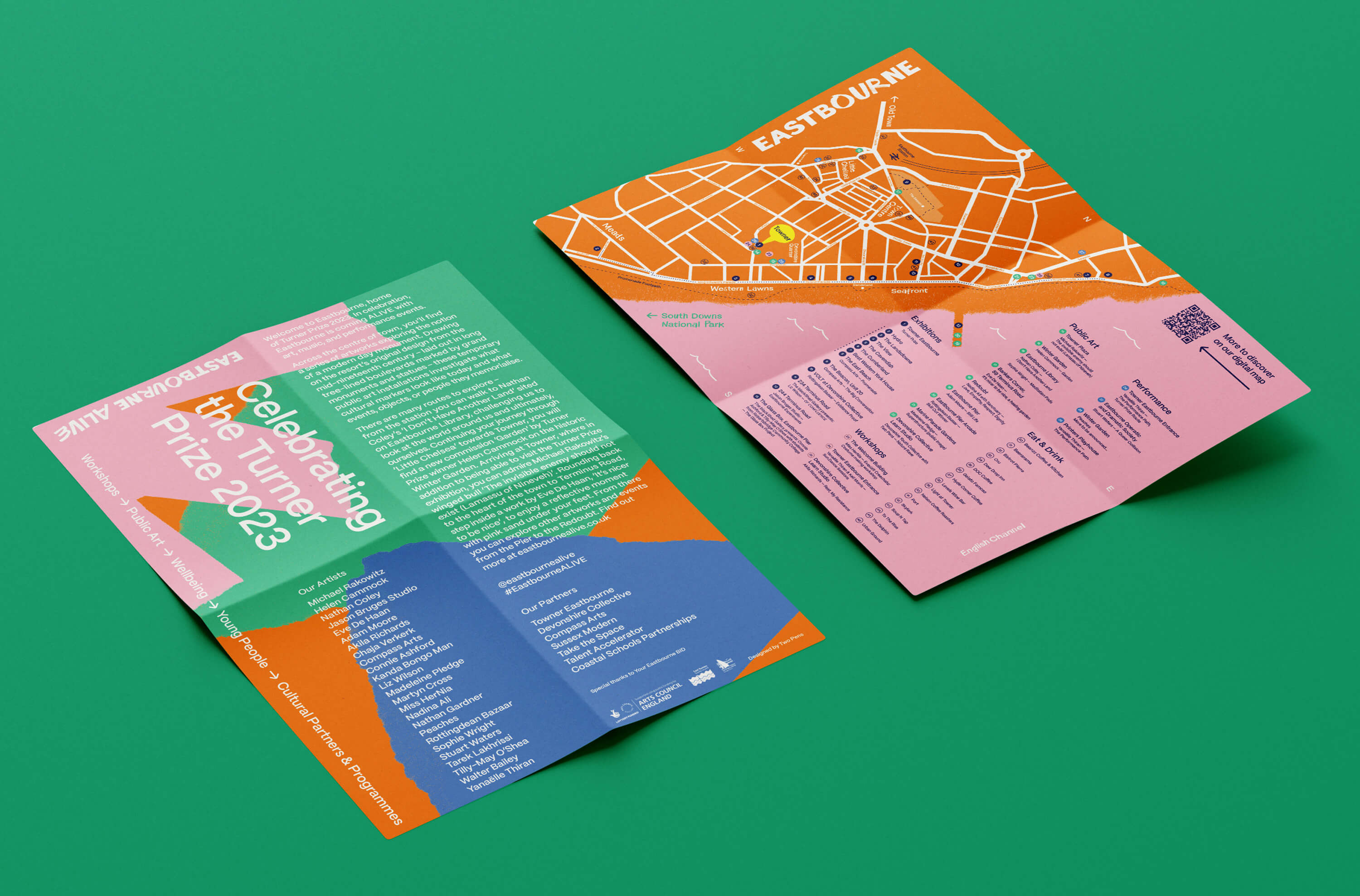
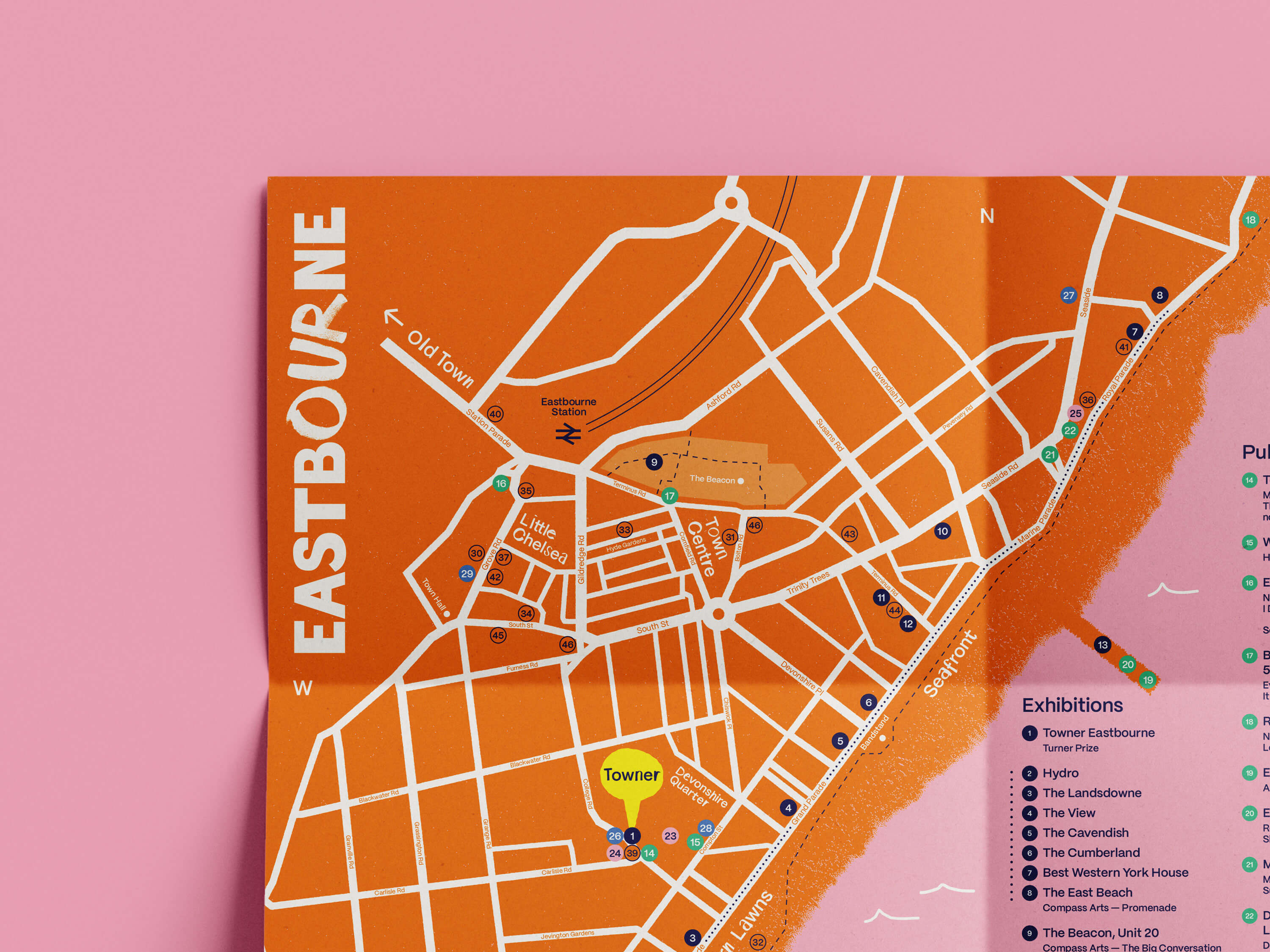
Trail Map
To help engage Eastbourne’s residents and the increased visitor numbers with the Eastbourne ALIVE programme, we designed a trail map, that included a description of the Eastbourne Alive programme and a map showing all the exhibitions and artworks, as well as other key Eastbourne locations and food & drink hot spots.
Read more →
Digital application
To compliment the print and other physical applications we developed a series of digital touch points. Including social media styling and Canva templates for the Towner team to use. These templates were designed to give both consistency and flexibility to the instagram posts and stories.
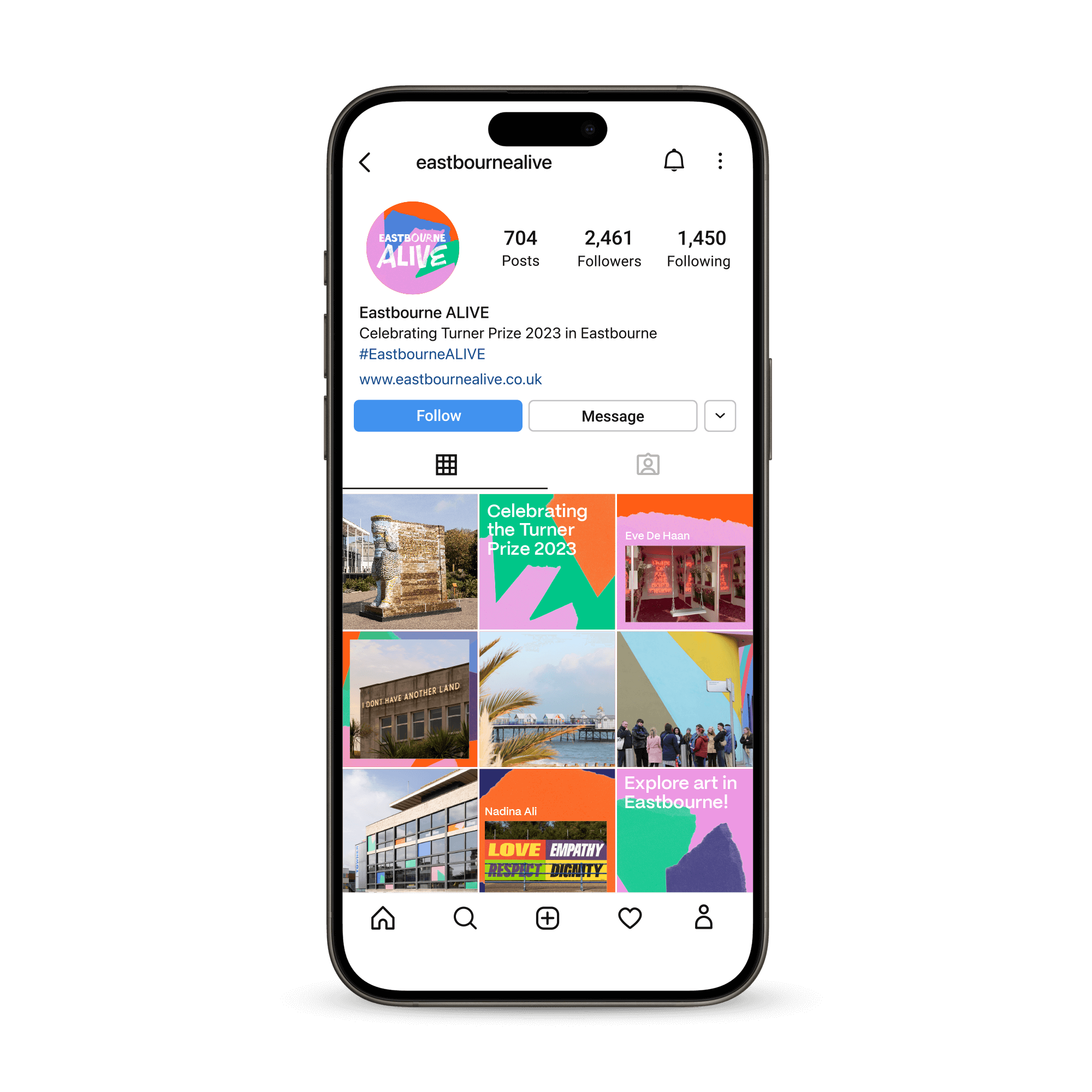
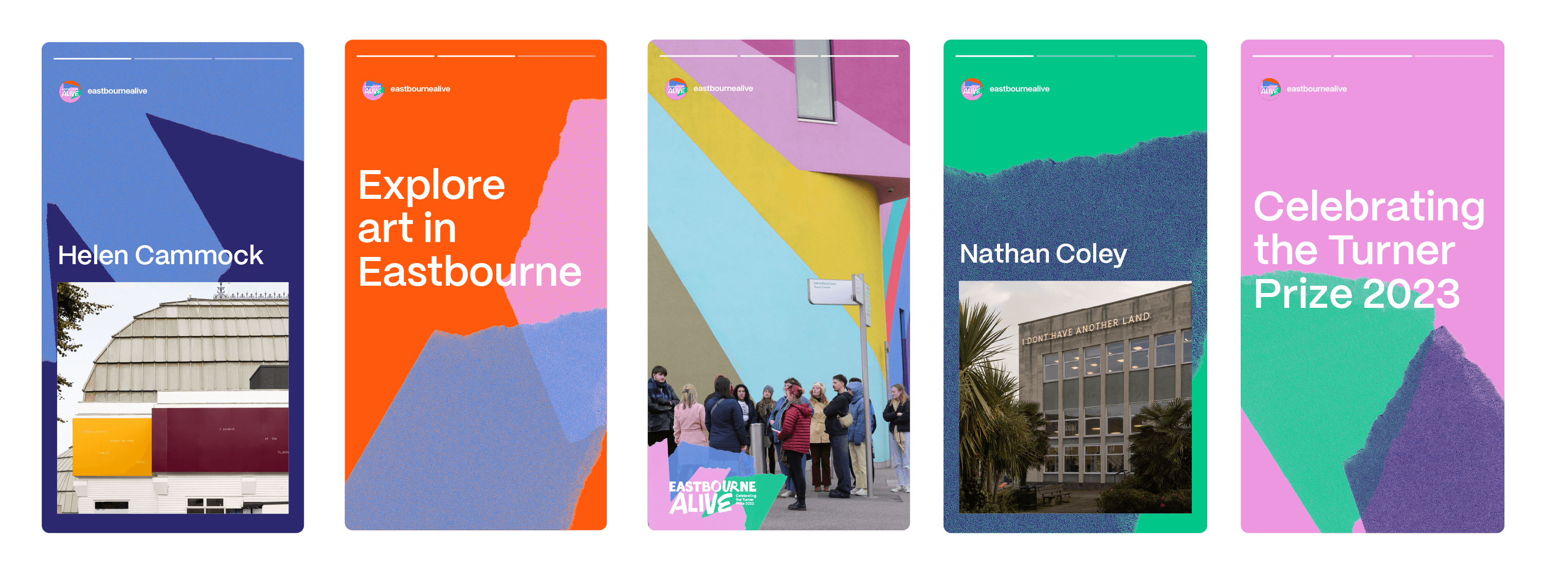
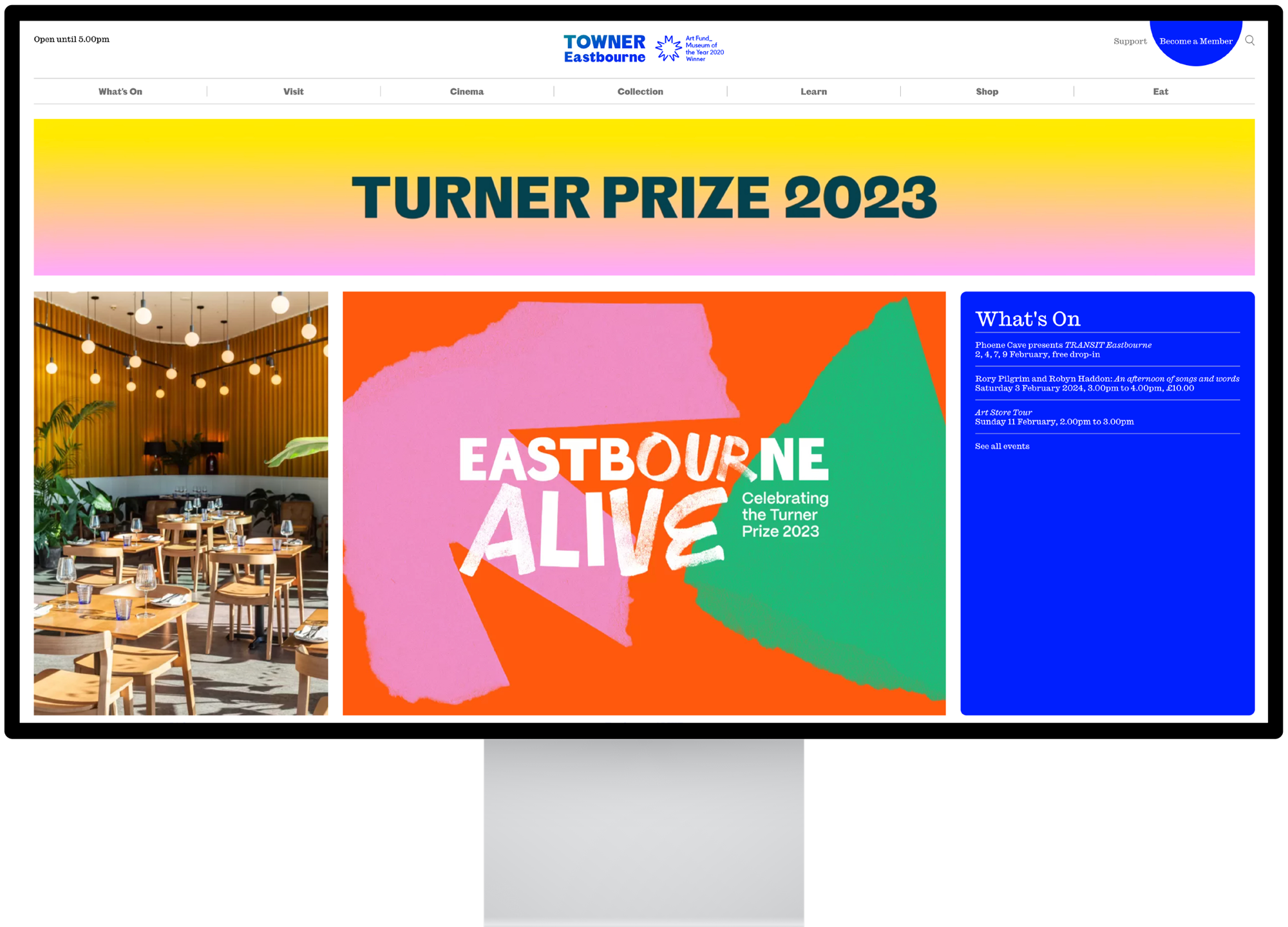
To round off the visual identity roll out, we designed and built a website for the Eastbourne ALIVE programme that introduced the project, displayed all the featured artists, and helped visitors plan their visit to the town via a custom, interactive map.
Read more →
