Nu Xform — SMaRT Building Specialists

- Visual Identity +
- Branding +
- Website Design +
- Document Templates
Nu Xform are SMaRT building specialists. From inception to delivery and beyond, they sit client-side, navigating the inherent challenges of a SMaRT project. Cutting through complexity and connecting the right partners and solutions.


The Brief:
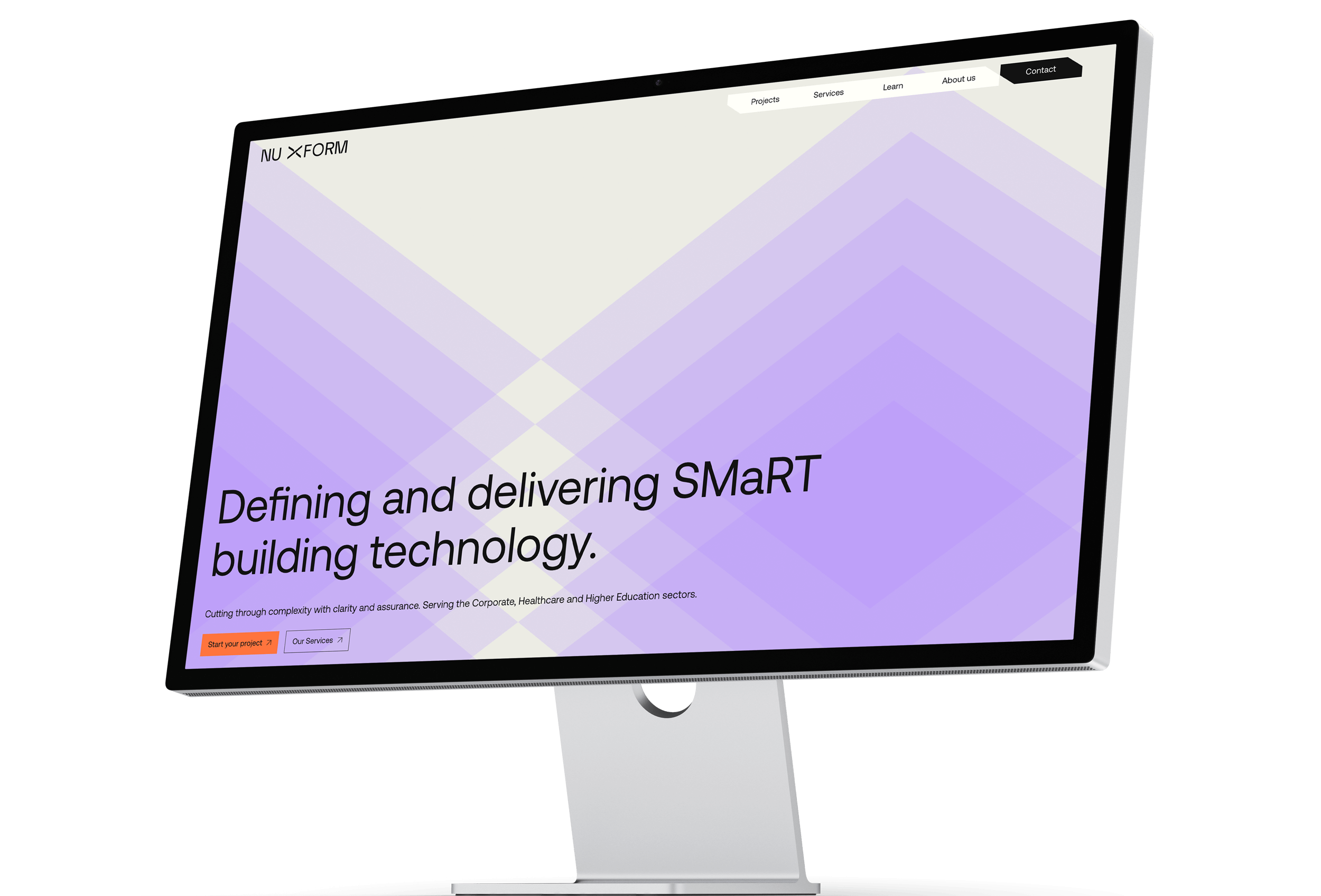
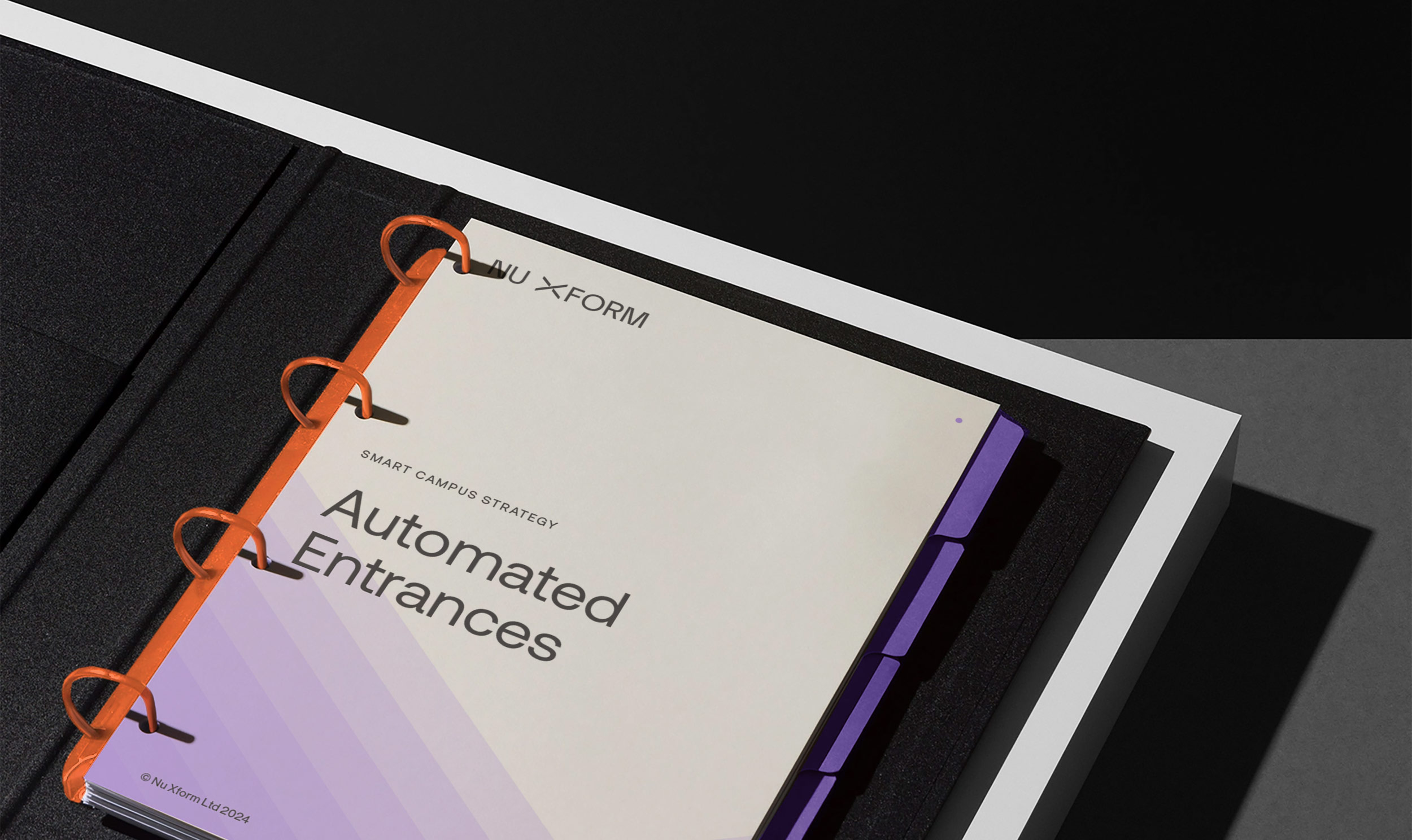
We were commissioned to work with Nu Xform and their team to re-imagine their visual identity, cementing their position as industry leaders and elevating them above their competition with strong, consistent visuals and clear messaging. The identity needed to work across multiple touch points, primarily their website and documentation.
Brand Positioning:
Building SMaRT spaces is complicated.
We change that.


Our Approach:
The updated Nu Xform visual identity is all about elevating space, enhancing connectivity, and pushing boundaries. Designed as a digital-first, tech-focused brand, the new look is built on simple, modular shapes that stack and repeat—mirroring the many layers of a SMaRT space, all seamlessly brought together by the Nu Xform team.
At the heart of this refresh is a custom logotype designed for improved clarity and legibility. A key update was introducing a space between “Nu” and “Xform,” ensuring consistency across all applications. Moving away from the softer forms of the previous logo, we opted for sharper, geometric letterforms that feel more precise and modern. The exaggerated apexes and vertex joins highlight the connections Nu Xform creates between customers and solutions. The “X,” central to the identity, now features vertical joins to create a sense of three-dimensional space—this element along with the angles of the “X” are carried through to the wider graphic system, tying everything together.
The supporting visuals replace inconsistent stock illustrations with a clean, structured approach. Simple geometric shapes, set on a 145-degree isometric grid, use transparency and repetition to create a sense of depth and movement. This system not only represents how Nu Xform elevates spaces through technology but also ensures consistency and ease of application across all brand touchpoints.
To future-proof the brand, we introduced a more confident colour palette and a strong yet minimal approach to typography. Together with the simplified graphic system, these elements create a flexible and scalable identity that positions Nu Xform as a leader in tech—contemporary, adaptable, and ready for what’s next.


