Ozone Coffee

- Visual Identity +
- Print Design +
- Signage +
- Website Design +
- Merchandise Design +
- Brand Guidelines
About Ozone
Ozone Coffee are a Coffee Roasters born in New Zealand in 1998, after over 25 years in the business and with 10 sites across NZ and the UK, they were in need of an identity that would grow with them and bring their customers along for the journey.
The Brief
Hasbean and Ozone are becoming a single brand, create a visual identity that can unify the wider ranging audiences and grow Ozone into one of the big player in specialty coffee. Ozone's personality is rooted in hospitality, create a visual identity that communicates this, both in it's retail locations and online.
Our Approach
Ozone is all about connecting with people, whether that's at one of their cafes or through a bag of coffee on their website, that means using simple, approachable communication. Alongside their in-house team we developed a visual identity that breaks down the complexity of specialty coffee into a simple yet beautiful system.
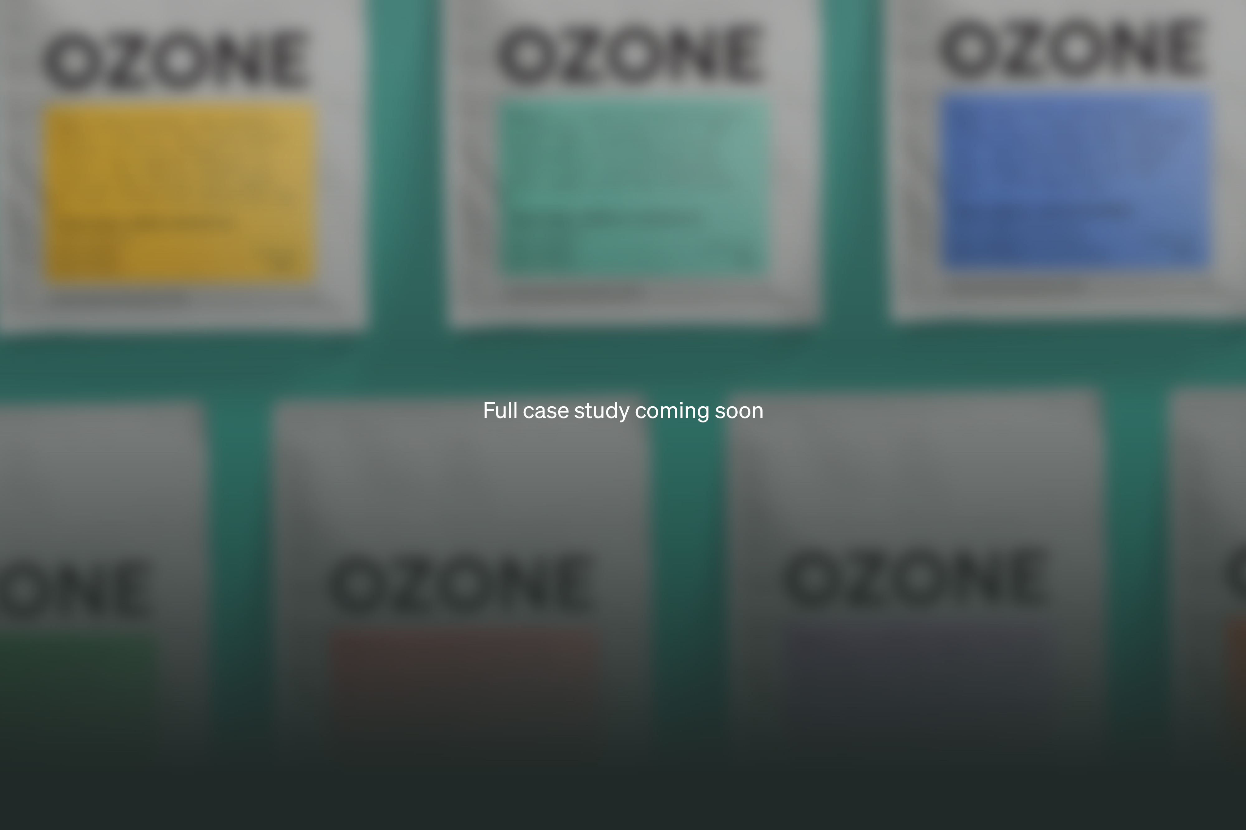
Based on the huge range of flavours that specialty can offer the system starts with 'colour = flavour' first, then introduces a long form flavour description that comes directly from the coffee roasting team and tells you exactly what to expect in the cup. Other details like varietal and process are then listed below. This structure allows people of all knowledge levels interact with the brand and understand what they're ordering. Whether it's knowing that you like the 'red' label coffees or that you enjoy and Anaerobic Naturally processed SL-28, Ozone's labelling system has you covered.
Using the coffee labeling as the anchor for the rest of the identity we left nothing left unchanged. From coffee packaging and an e-commerce website to location signage and cafe menus, email campaigns and social media templates. At every touch point we ensuring that we were making specialty coffee accessible to everyone.